
Streamlined, memorable and scalable
Vastly
Services
Branding, Corporate ID, Brand Standards, Website
Industries
Technology, AI & B2B SaaS
Office
USA

01 — Brand identity for an AI-powered B2B SaaS platform
A clear and enduring creative direction
My role: Creative Director, leading a creative team and providing counsel to the messaging team.
Ed Pires authored the complete Vastly brand identity: logo, visual language, brand standards and website design. Vastly's Ekanos platform uses AI to connect and orchestrate business systems.
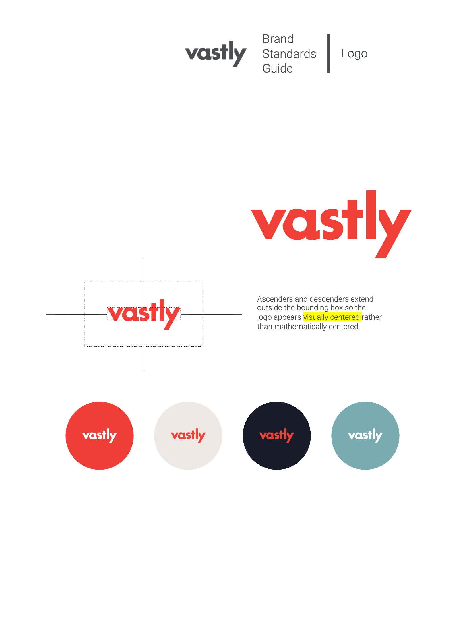
The brand guide establishes the creative direction for the company as it steps into its identity for 2025 and beyond. At the foundation is a simplified Vastly logo designed for stronger impact, easier recognition and greater long-term equity.
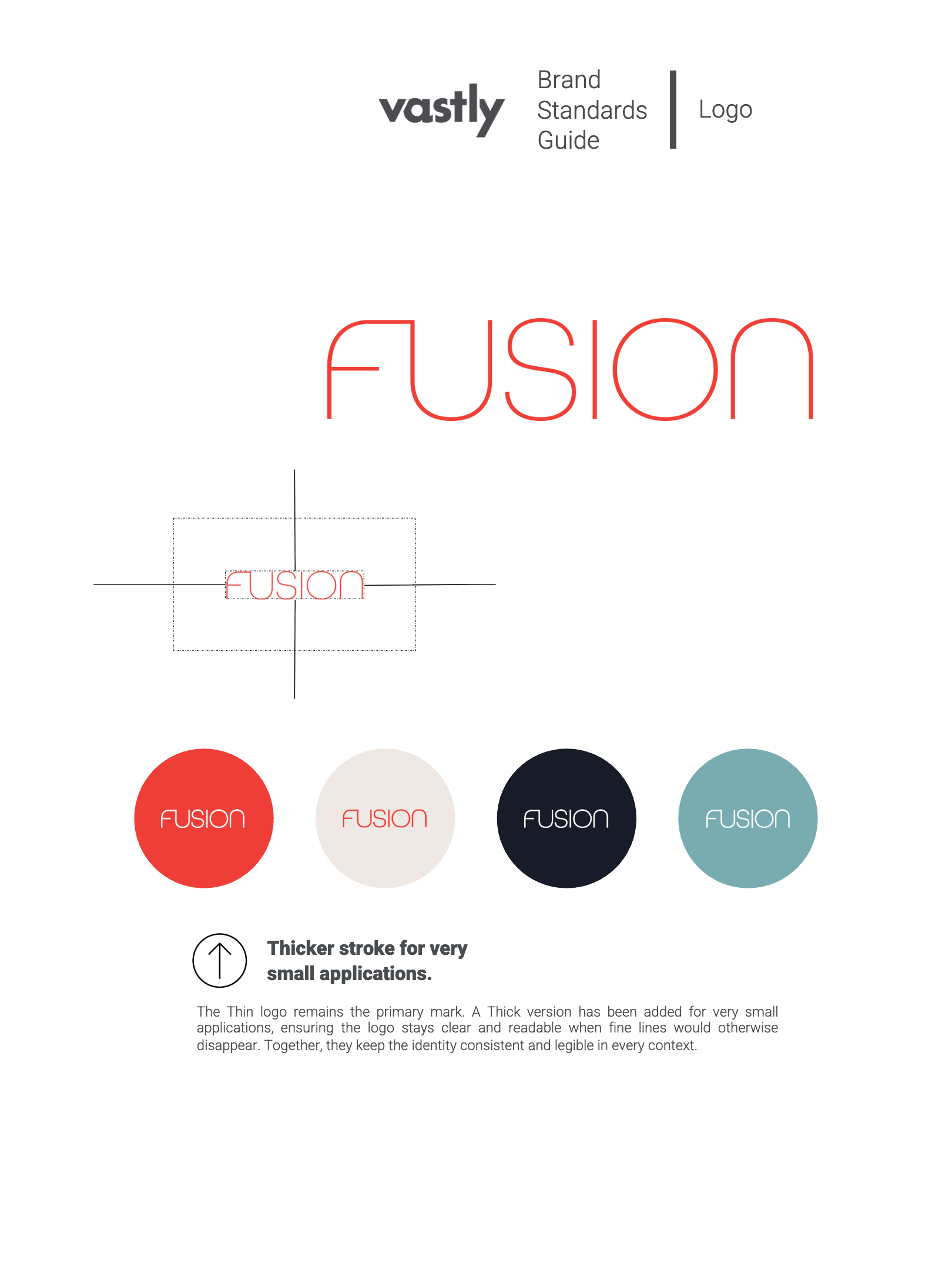
The Thin logo remains the primary mark. A Thick version was added for very small applications, so the identity stays clear and readable when fine lines would otherwise disappear.
Visit govastly.com ↗
02 — Alternative modular logo
The chevron mark: simplify, amplify
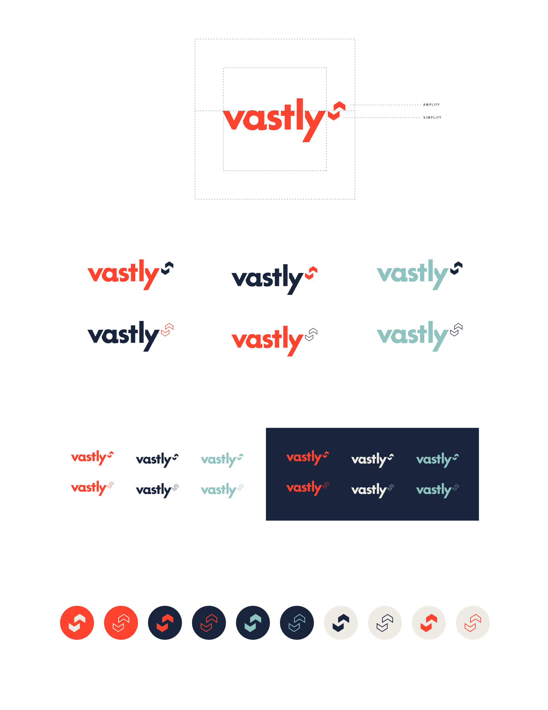
An alternative modular version of the logo pairs the wordmark with a chevron symbol built from two strokes named Simplify and Amplify. The modules work together or apart: the full lockup, the wordmark alone, or the chevron on its own as an avatar.
It runs in Vastly red, navy and teal, in solid and outline versions, on light and dark grounds.
03 — Brand architecture
Fusion, a child brand under the Vastly umbrella
The simplified parent logo creates room for the Fusion logo system. Fusion lives under the Vastly umbrella without diluting the authority of the parent, and it has the strength to stand on its own with a design system that complements Vastly rather than mimicking it.

04 — Visual language
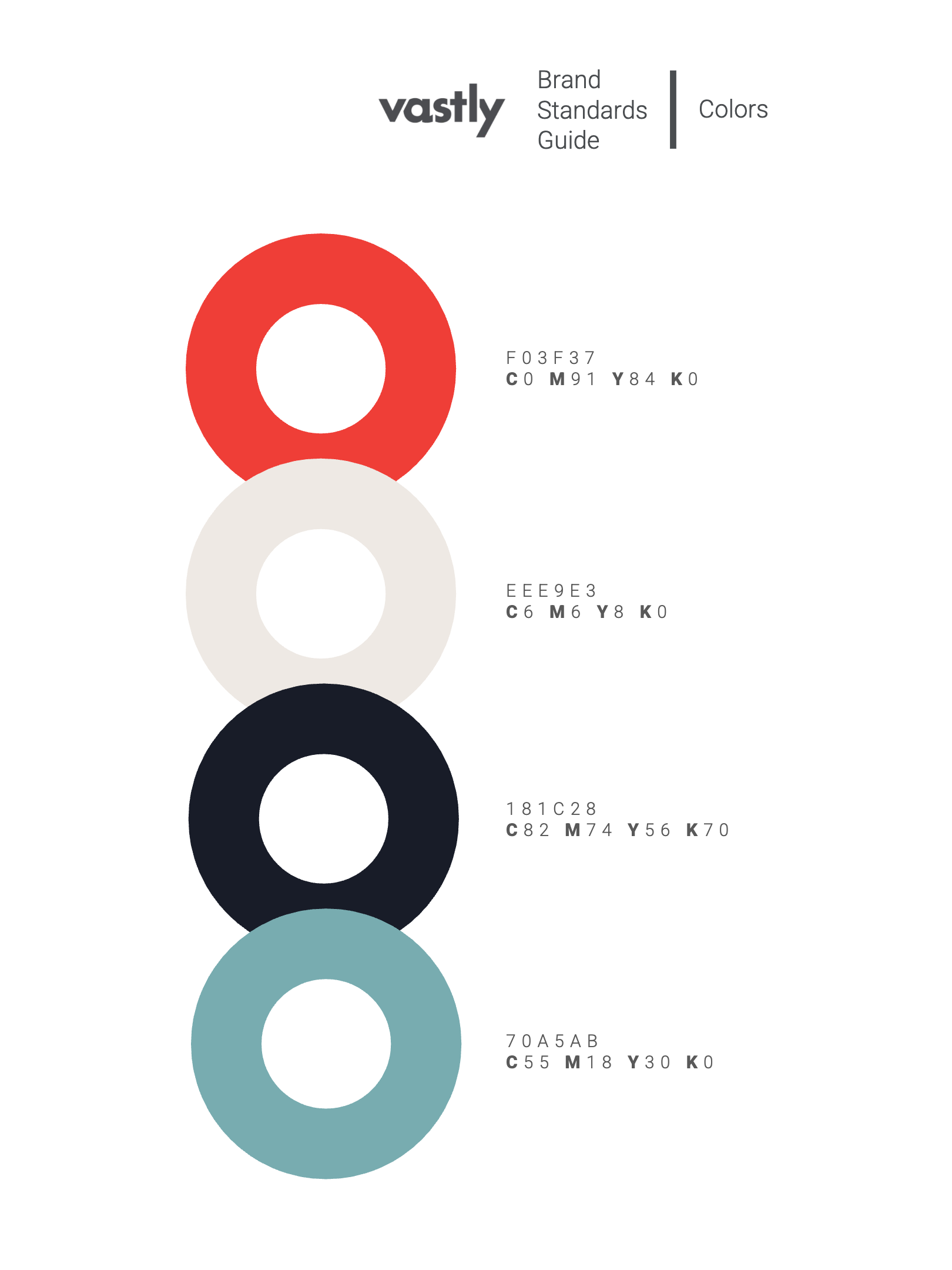
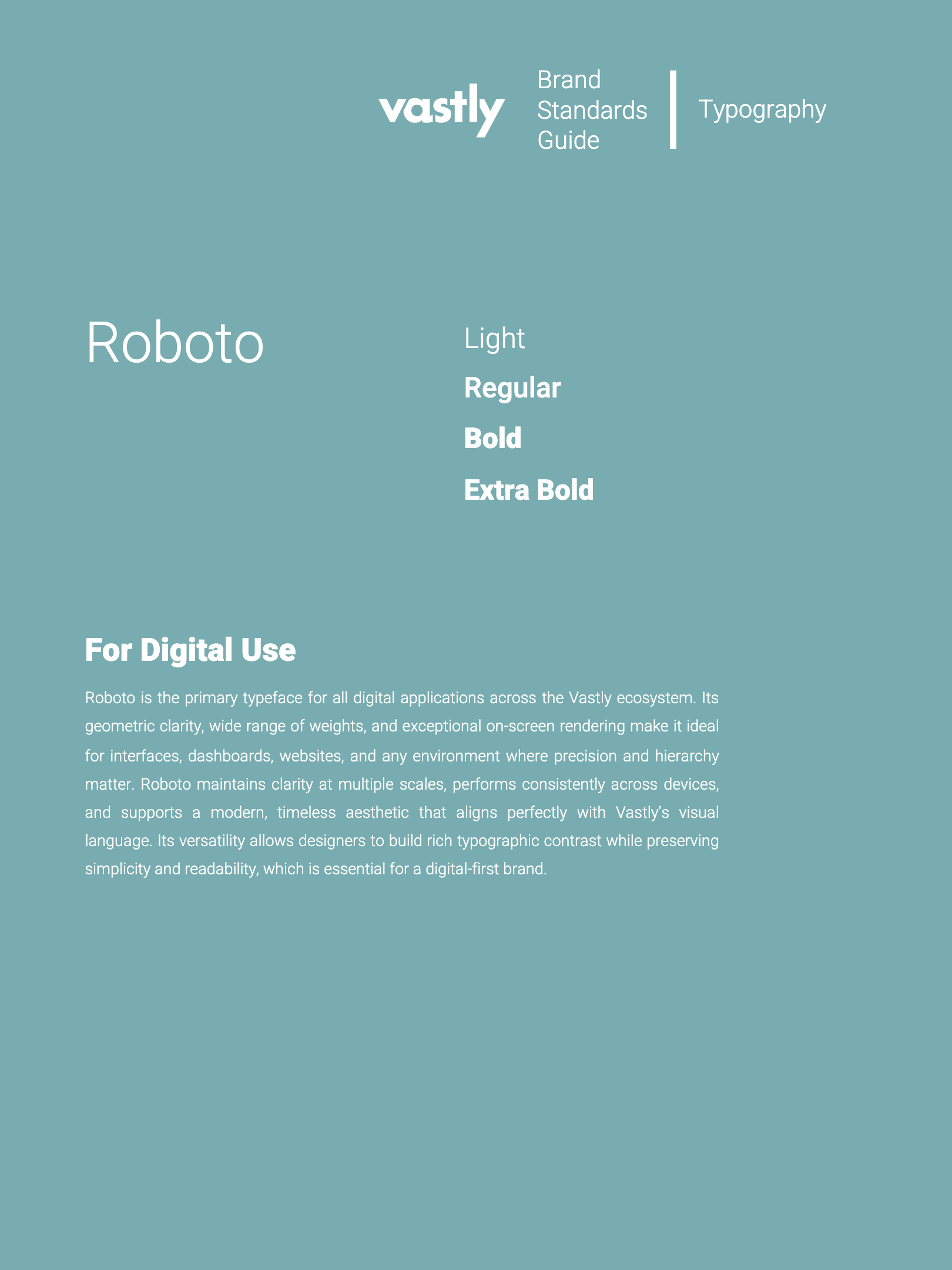
Color, typography and negative space
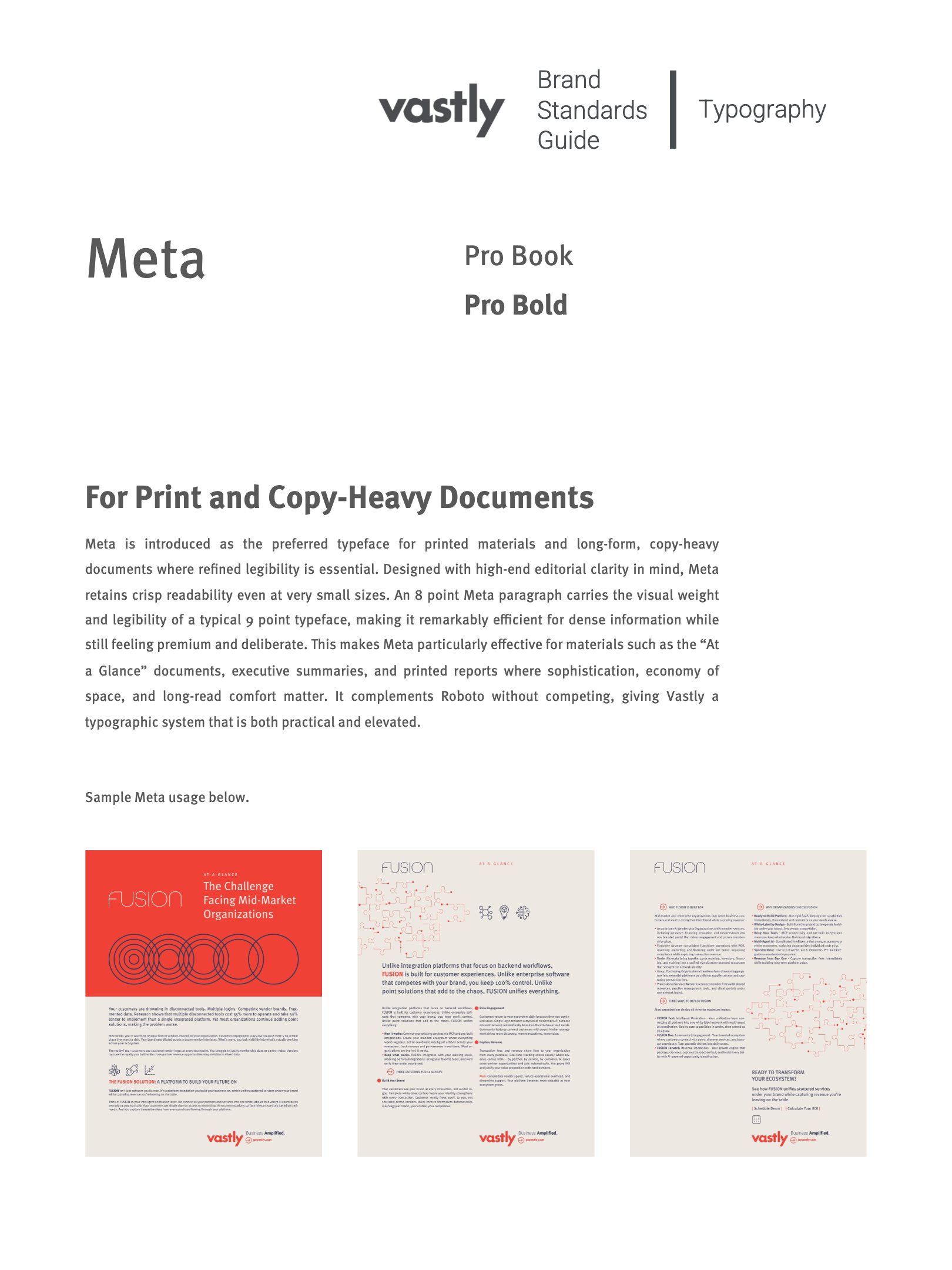
A new color palette creates harmony and contrast while improving legibility in digital and print. Roboto carries every digital application, chosen for its range of weights and on-screen clarity. Meta is introduced for print and copy-heavy documents, where an 8 point paragraph reads like a typical 9 point face.
Ample negative space is a key design principle. Generous breathing room around information keeps presentations open, calm and uncluttered, so content feels premium and intentional.
05 — Standards applied
Homepage as a model for brand application
The homepage applies the brand principles with clarity and discipline, showing how simplicity, hierarchy and negative space create a sophisticated digital environment. It presents Vastly as the parent brand while Fusion appears as a distinct but connected extension.
Color, typography, line art and photography all follow the system, so the homepage serves as the blueprint for every interior page.
See the live site ↗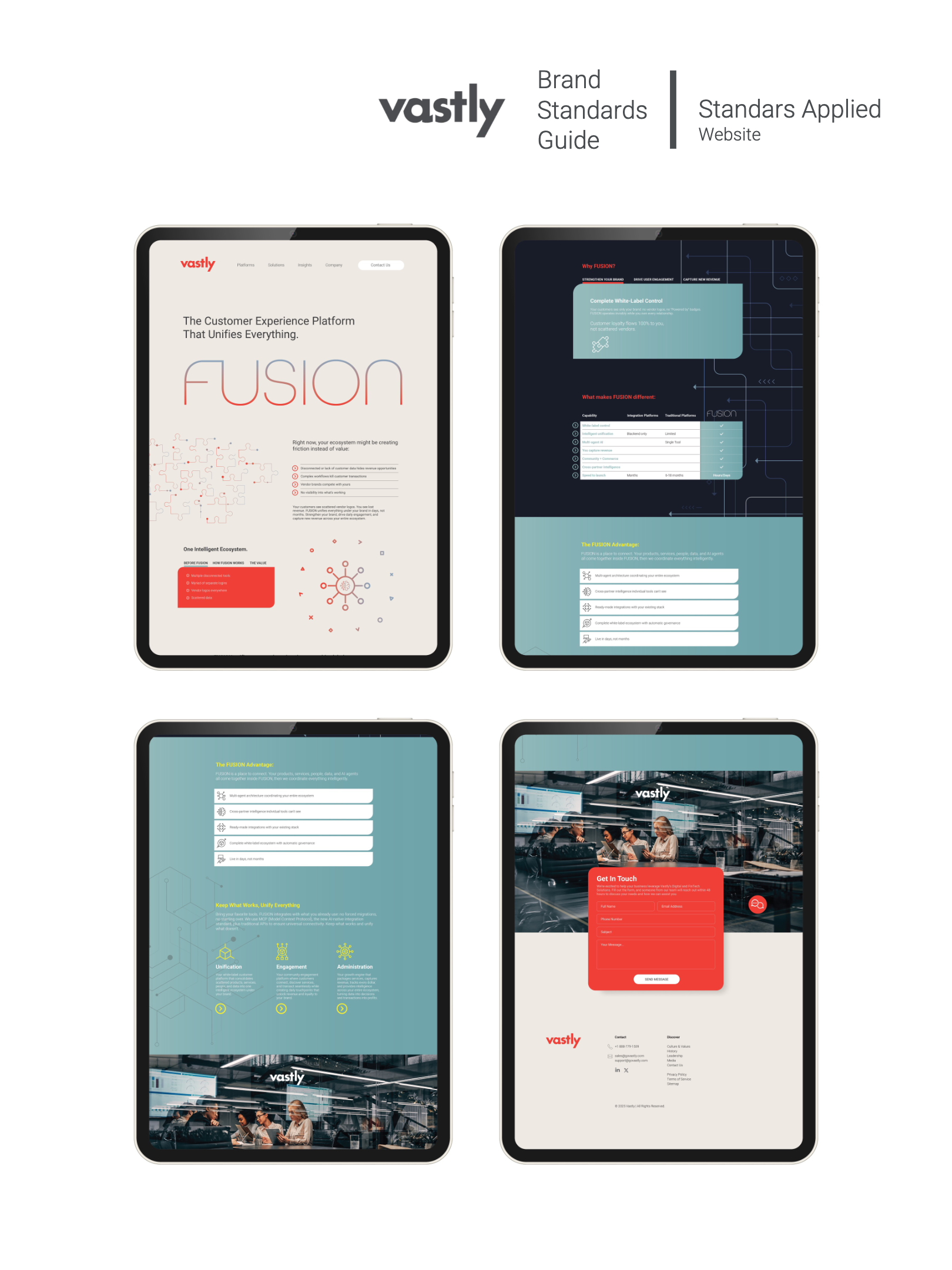
From Noise To Clarity
The brand book describes the building. The visual system is the building's structural code.From “A visual system is not a style guide. Here is the difference.” →
Next Project
Iconist
More like this
Related Projects.


Index
22 projects
Snack with Purpose
Nature's Garden

Powering a positive global impact
Sustainability Brands

Design is thinking made visual
Video Design
Streamlined, memorable and scalable
Vastly
Where icons are built not born
Iconist
Pro baseball. No filter.
Atlantic League

Blessed with beauty
3 Graces
Government Innovation
RSI
Inspired & Equitable Legal Services
CSG Law

Corbin Russwin & Sargent Re-Branded
Assa Abloy
Transform your contact center
NobelBiz
Smarter advertising
Edge226
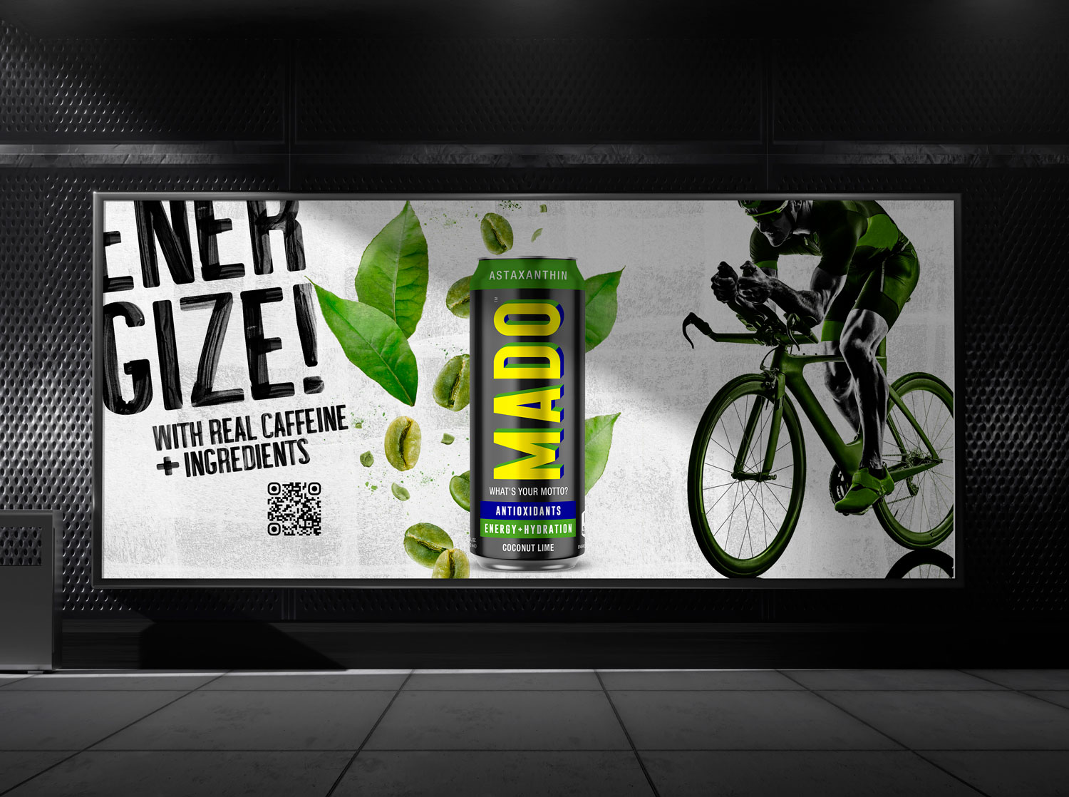
Energy Drink
MADO
Good design + healing vibes
Wellness Brands

Good design for the win
Sports & Entertainment Brands

Freeze dried fruit snacks
CrispyGreen

Roy Lichtenstein inspired photoshoot
Kurv Magazine

Bridal couture branding
Isabelle Armstrong
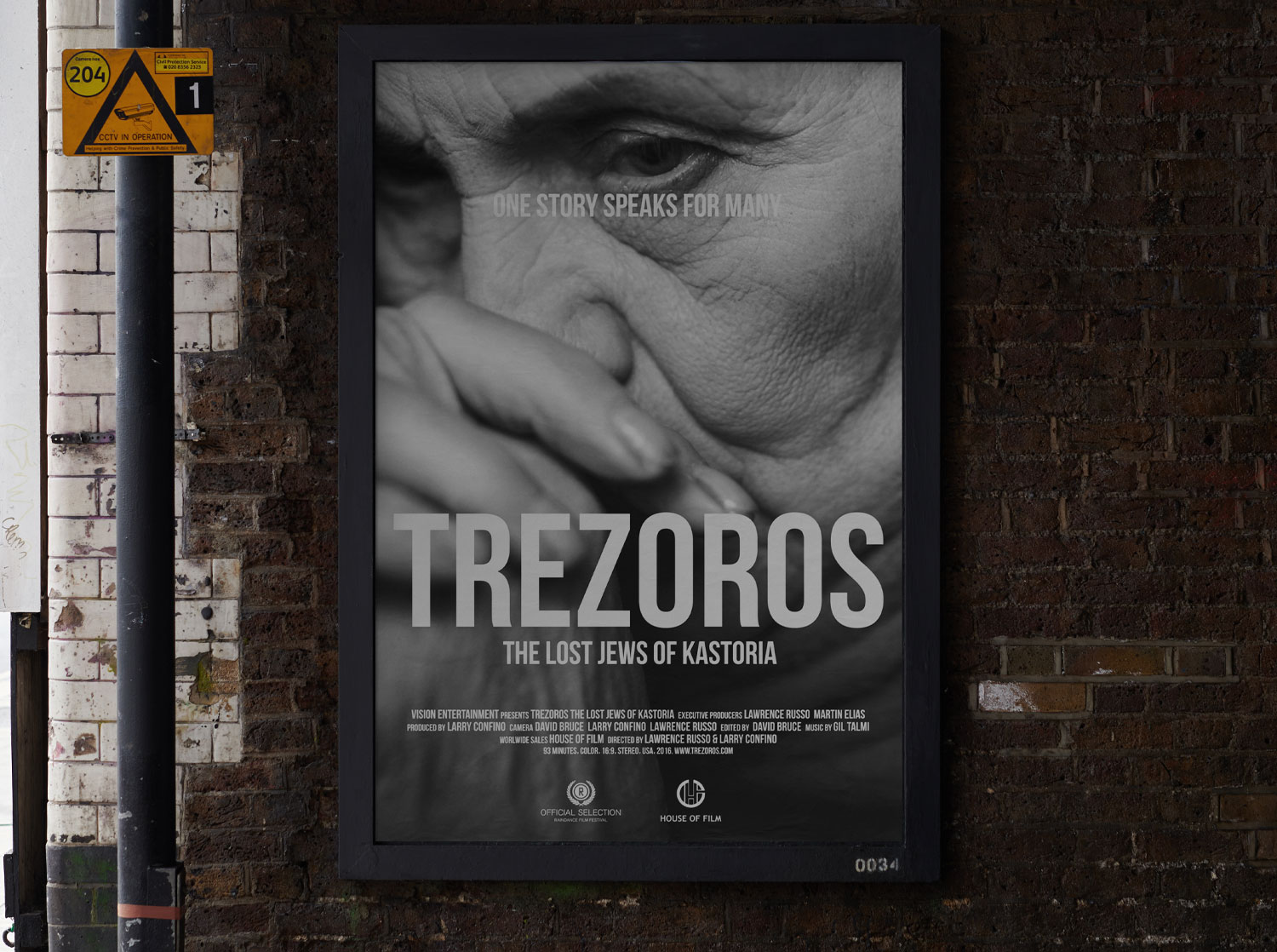
Emotionally charged design
Trezoros Film
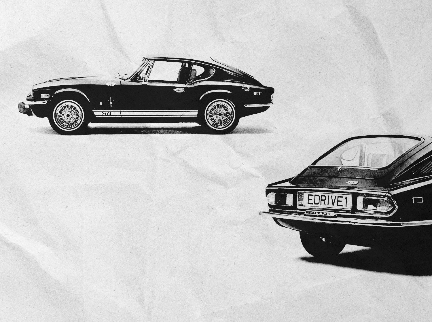
Classic is timeless
E-Drive Retro
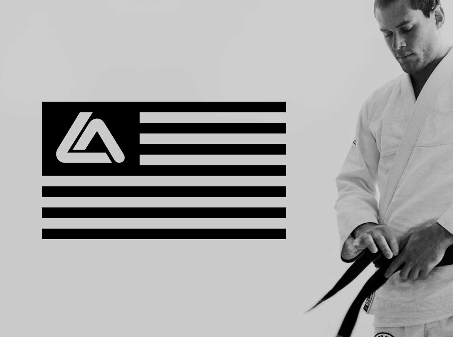
Jiu Jitsu is easy
Roger Gracie Academy
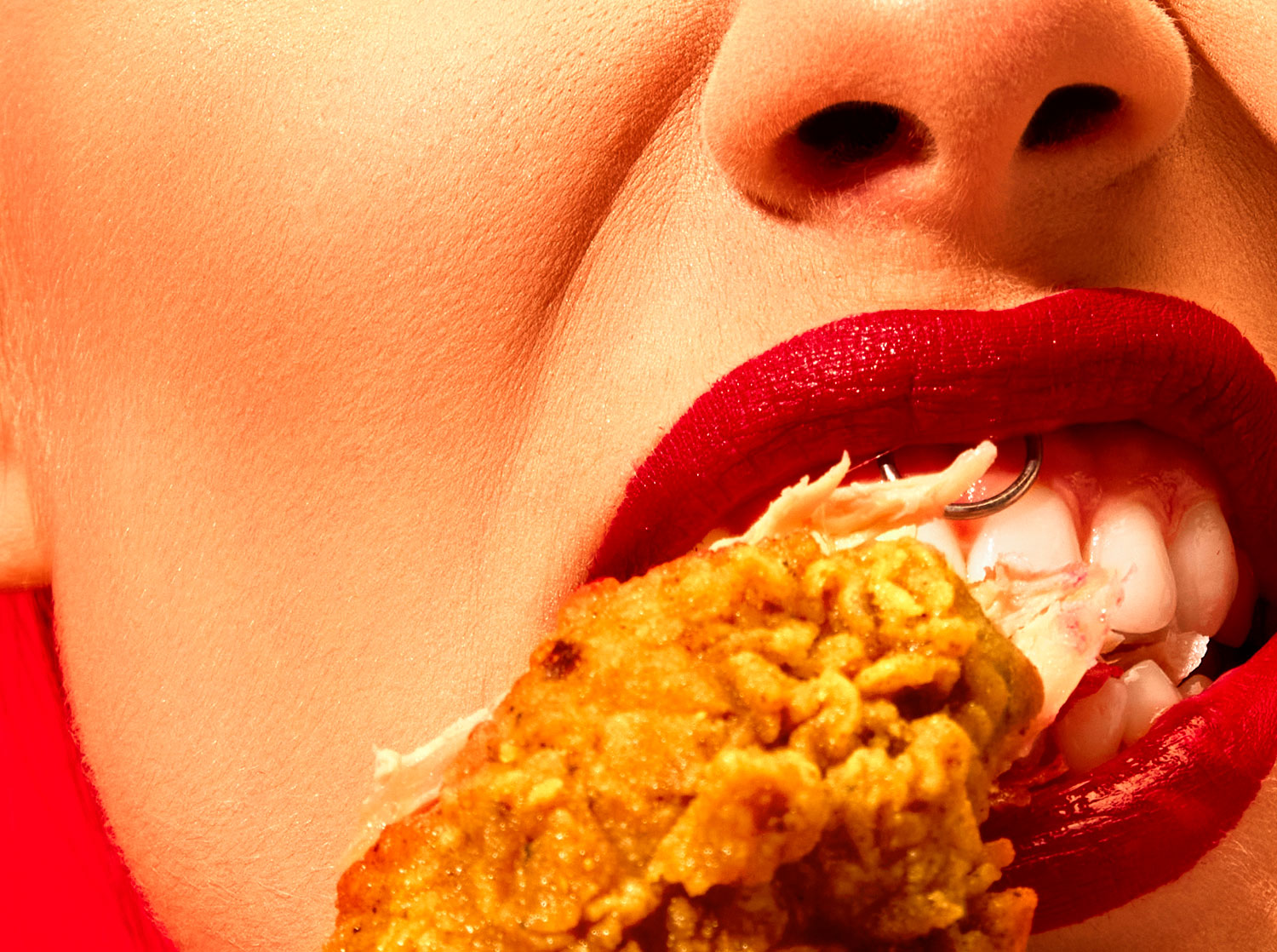
Top chef & Top shelf
Food & Beverage Projects
Index
19 projects
Snack with Purpose
Nature's Garden
Powering a positive global impact
Sustainability Brands
Streamlined, memorable and scalable
Vastly
Where icons are built not born
Iconist
Pro baseball. No filter.
Atlantic League
Blessed with beauty
3 Graces
Government Innovation
RSI
Inspired & Equitable Legal Services
CSG Law
Corbin Russwin & Sargent Re-Branded
Assa Abloy
Transform your contact center
NobelBiz
Smarter advertising
Edge226
Energy Drink
MADO
Good design + healing vibes
Wellness Brands
Good design for the win
Sports & Entertainment Brands
Freeze dried fruit snacks
CrispyGreen
Bridal couture branding
Isabelle Armstrong
Classic is timeless
E-Drive Retro
Jiu Jitsu is easy
Roger Gracie Academy
Top chef & Top shelf
Food & Beverage Projects